The Most Fascinating Map You’ll See Today: The World’s Electrical Infrastructure in One Interactive Infographic
Introduction
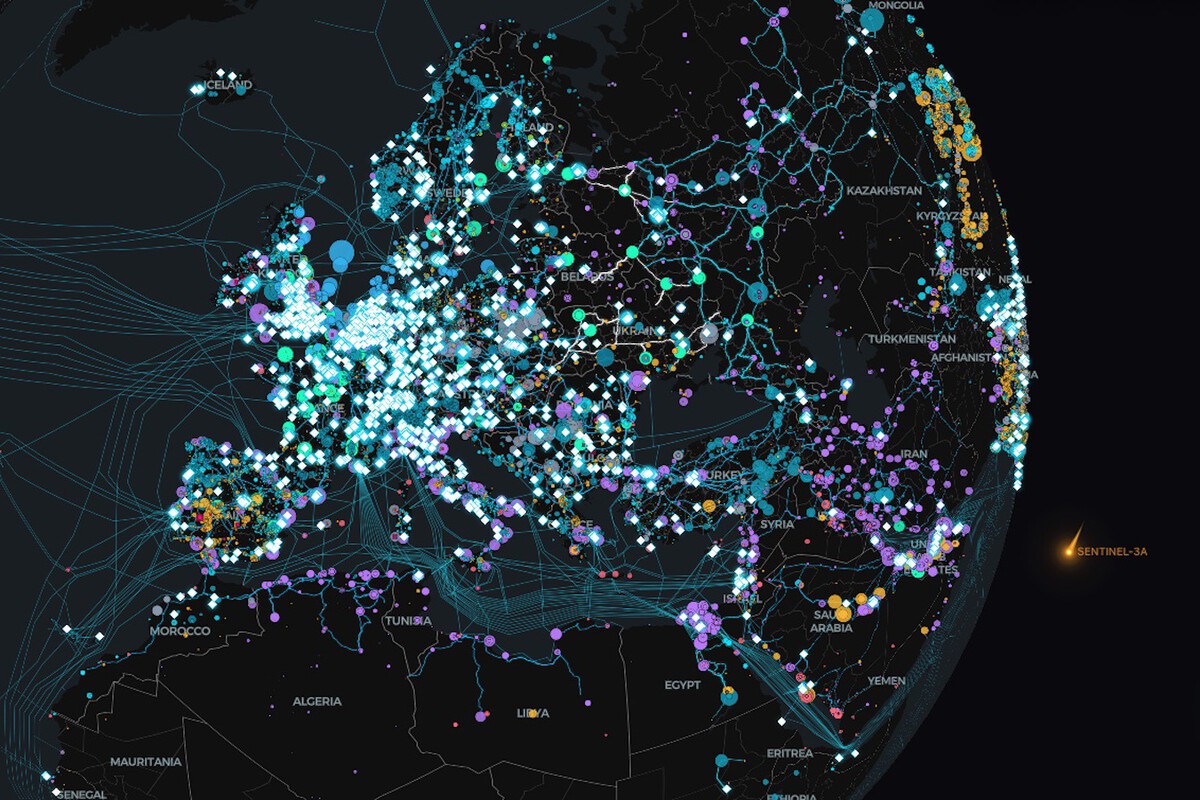
Imagine being able to visualize the entire electrical backbone of our planet in a single map. From power plants and transmission lines to substations and energy flows, a new generation of interactive infographics is making this possible—turning complex global infrastructure into something both accessible and captivating.
This isn’t just visually impressive; it’s a powerful way to understand how modern civilization is powered.
What Does the Map Show?
This type of interactive map typically includes:
- Power generation sources (coal, nuclear, hydro, solar, wind)
- Transmission networks spanning countries and continents
- Substations and distribution hubs
- Cross-border energy connections
- Real-time or estimated energy flows
By zooming in and out, users can explore everything from global patterns down to regional grids.
Why Is It So Fascinating?
1. It Reveals Hidden Complexity
Electricity is something most people take for granted, yet the infrastructure behind it is incredibly complex. The map exposes a vast, interconnected system that operates continuously and almost invisibly.
2. It Shows Global Interdependence
Many countries rely on imported electricity or shared grids. The visualization highlights how energy connects nations, making infrastructure a matter of both engineering and geopolitics.
3. It Makes Data Tangible
Abstract numbers become visible patterns. Instead of reading statistics, you see how energy moves across the world.
Educational and Practical Value
For Students and Researchers
- Understand energy systems visually
- Study the transition to renewable energy
- Analyze regional dependencies and vulnerabilities
For Professionals
- Identify infrastructure gaps
- Explore investment opportunities
- Monitor grid resilience and expansion
For the General Public
- Gain awareness of energy consumption
- Better understand sustainability challenges
- See the scale of the energy transition
The Role of Interactivity
Unlike static maps, interactive infographics allow users to:
- Filter by energy source
- Track changes over time
- Focus on specific regions
- Simulate scenarios (in advanced tools)
This transforms passive viewing into active exploration.
What It Tells Us About the Future
These maps are more than just visual tools—they hint at where we’re heading:
- Expansion of renewable energy networks
- Decentralization of power generation
- Increased grid connectivity across borders
- Smarter, data-driven energy systems
As the world transitions to cleaner energy, these visualizations will become even more important.
Conclusion
The global electrical infrastructure map is more than a technical diagram—it’s a window into the systems that sustain modern life. By turning complexity into clarity, interactive infographics help us appreciate not only how energy works, but why it matters.
In a world increasingly driven by data, seeing the invisible may be the first step toward understanding—and improving—it.


Recent Comments